Monday, May 23, 2016

Quality Piece

Kevin Repice, Landscape Painting (Quality Piece), 2016, Paint
I chose this piece because I used many different elements and principles of art (value, color, balance, etc.) to create it. I was also very adamant about checking this with the teacher to make sure I would get a good grade because I cared about the project. I also managed to do this very quickly, even with a day or two lost because of the AP Exams.

Landscape Painting

 Kevin Repice, Landscape Painting, 2016, Paints (Acrylic and Tempura)
I learned that there is no complete white or black; it's a mix of different shades of a color. I like the way the rock formation was differently painted. I would improve the waves in the ocean.
Sketch included below.

Social Awareness Poster Photoshop

Kevin Repice, Social Awareness Photoshop, 2016, Photoshop
I learned about the damaging affects of elephant poaching during this project. I like how the tusks were made into the spine and ribs. I would improve the tusks on the right hand side and the number to show what I meant by 10 tusks times 3000.

Surreal Fairy Tale Photoshop

Kevin Repice, The Fox And The Crow Surreal Photoshop, 2016, Photoshop
I learned how to use Photoshop and create an image and picture using the program. I like the background and how the colors contrast each other between warm and cool colors. I would improve how much the crow stands out and the branch it stands on.
Sketch included below.

2-D to 3-D Sculpture


Claude Monet, San Giorgio Maggiore at Dusk, 1912, Oil on Canvas
 Kevin Repice, San Giorgio Maggiore at Dusk 3-D Top View, 2016, Mixed Media
 Kevin Repice, San Giorgio Maggiore at Dusk 3-D Front View, 2016, Mixed Media
 Kevin Repice, San Giorgio Maggiore at Dusk 3-D Right View from Front, 2016, Mixed Media
Kevin Repice, San Giorgio Maggiore at Dusk 3-D Back View, 2016, Mixed Media
Kevin Repice, San Giorgio Maggiore at Dusk 3-D Left View from Front, 2016, Mixed Media
I learned that trying to create a cardboard sculpture takes more effort and time than I expected. I like the tissue paper as the background. I would improve the painting on the cardboard for the sea.

Clay Project Alternate Assignment


Kevin Repice                                                                                                                        Period 7
Clay Project Alternate Assignment
Ceramics is the two thousand plus year old art or technique of making objects from clay and firing them at high temperatures in a kiln so that they permanently keep their sculptural forms (3-D). It is an example of functional art, art that also has another job, and is sometimes called “art pottery”. “Art pottery” is created largely for its decorative, aesthetic value more than its utilitarian/functional value. “Art pottery” includes clay sculptures, as well as, plates, platters, casseroles, mugs, mixing bowls, bathroom tiles, etc. Ceramics is one of the most ancient industries in the world. Dating as far back as 24000 BC, clay was used in addition with water and heating to create animal and human figurines found in present day Czech Republic. Around 10000 years later (14000 BC), tiles were formed in Mesopotamia and India. The first functional use of pottery is believed to be seen around 9000 or 10000 BC. Clay bricks were created at around the same time. At around 5000-8000 BC, glaze was discovered in Egypt. By 3000 BC, the potter’s wheel was created. In ninth to first century BC, glaze was being used for making clay impermeable to liquids, so that it is easier to store liquids. In fifth century, African terracotta sculptures were seen. In the Han Dynasty of China (206 BC-220 CE) porcelain for ceramics was first seen.
Clay can be used as a medium for ceramic artwork. Clay has plasticity, meaning that it can hold its form while being able to be manipulated by the artist’s hands. It also has porosity, meaning it is porous enough to dry without cracking. And lastly, clay has vitrification, meaning clay can be hardened or it becomes glasslike. Clay is soft and malleable and found in the earth. There are three different types of clay: stoneware, terracotta, and porcelain. Stoneware is a dense, hard, and nonporous (no holes) type of clay that fires white at around 1200-1300 degrees Celsius, or 2190-2370 degrees Fahrenheit. Terracotta is a durable, strong, low-fired, red type of clay most famously used in the Terracotta Warriors guarding Emperor Qin Shi Huang in Xi‘an, China. Porcelain is a type of clay that is fired at 2300 plus degrees Fahrenheit, and offers the optimum qualities of smoothness. It is made with the ingredient kaolin, or china clay, mixed with other ingredients to give it plasticity and to achieve the dense, hard, white, translucent clay body of porcelain.
Functional art describes aesthetic objects that have utilitarian purposes, while fine art applies to works that carry an intellectual and emotional sensibility alongside a dose of old-fashioned beauty. Ceramic art is a type of functional art because it includes making pottery and other things that can be used for other uses. Vases, bowls, cups, and storage containers are all examples of how ceramics is a type of functional art.
The three types of building construction for ceramic art are pinch construction, coil construction, and slab construction.
Pinch Construction- An ancient and contemporary form of pottery construction which begins with a ball of clay. Thumbs are pushed into the center and walls are thinned using pinching. A flat base is made by pushing the bottom onto a flat surface.
Coil Construction- A type of clay construction which begins with chunks of wedged clay shaped into coils of evenly rolled out clay and scored, slipped, stacked on, and sometimes smoothed around a base to create a vessel.
Slab Construction- A type of clay construction which begins with clay that is wedged, evenly rolled out flat, cut into shape, and joined to other clay pieces.
To join pieces of clay together, there needs to be three things done: wedging the clay, scoring the clay, and adding slip. Wedging is kneading the clay to eliminate all air bubbles from the clay so that the piece will not “blow up” in the kiln. Scoring is a process in which a person scratches, or roughens, 2 pieces of wet clay with a tool to join them together. Slip, a mixture of water and clay used as “glue” to knit pieces of clay together for firing. It is added for sealing between two pieces of clay.
To use the wheel in ceramics is to use the potter’s wheel to create a vessel from wet clay. This process is different from hand-building clay because it uses the aid of a either manual or motorized rotating piece to help create an even surface all the way around the vessel rather than having the artist walk around the vessel to gain that same effect.
The three stages of clay drying are green ware, leather-hard, and bone dry. Green ware is first and it is unfired, wet clay. Leather-hard is second and is partially dry clay still unfired. Bone dry the last in the drying process and is dry, fragile clay with no water left in the clay. Bone dry clay is ready to be fired.
A kiln is an enclosed device or oven that is designed to permanently harden clay. The kiln uses heat at very high temperatures to make sure that clay hardens and maintains its form and structure so that the clay can be decorated and/or glazed. Bisque firing is the first firing of clay in the kiln before painting or glazing the clay.
Glaze is a thin coating of minerals and pre-melted glass painted on the surface of clay that has  a glasslike appearance after glaze firing, the second ceramic firing of clay. It is used in ceramics to give clay a glassy and glossy look. It also serves to color, decorate, waterproof, or weatherproof a vessel.
Ron Nagel, a Californian artist, has simple designs with intricate colors, shape and textures. Most of his works are small, but each and every one is explicitly detailed in its own way.
Sterling Ruby’s ceramic artwork is very chaotic and looks very messy, like Jackson Pollock mixed with clay. There seems to be a pattern of randomness with his ceramics and he seems to enjoy the warm colors and earthen colors in his artwork.
Citations

Printmaking Plate And Prints

Kevin Repice, Printmaking Plate, 2016, Mixed Media
 Kevin Repice, Print AP, 2016, Ink
 Kevin Repice, Print 1/5, 2016, Ink
 Kevin Repice, Print 2/5, 2016, Ink
 Kevin Repice, Print 3/5, 2016, Ink
 Kevin Repice, Print 4/5, 2016, Ink
Kevin Repice, Print 5/5, 2016, Ink
Kevin Repice, Print Evaluation, 2016, Pencil
I learned that it is harder than I thought to make a solid print. I like how smooth some of my prints turned out. I would improve print 1/5 because I smeared a little ink on it by accident.

Symbolic Self Portrait

Kevin Repice, Symbolic Self Portrait, 2016, Mixed Media
I learned that using the element of space creates a more centered image and more emphasized picture. I like the Rita's Logo in the top center. I would improve the quality of the watercolors and try to make the paint more solid and cleaner lines.

Narrative Watercolor Portrait with Hybrid

 Kevin Repice, Narrative Watercolor Portrait with Hybrid, 2016, Mixed Media
I learned that drawing a face uses many proportions rather than trying to eyeball it. I like the monochrome color scheme. I would improve the details of the face and the size of the hybrid creature.
Sketch included below.

Collage Sculpture Drawing

Kevin Repice, Collage Sculpture Drawing, 2015, Mixed Media
I learned that using sold colors to create the collage made it easier to draw the sculpture and add color to the drawing. I like the simplicity of the colors. I would improve the shading and value of the colors.

Sunday, May 22, 2016

Collage Paper Sculpture


Kevin Repice, Collage Paper Sculpture, __, Mixed Media
I learned how create a self standing sculpture with just paper and hot glue. I like the simple and solid colors on the sculpture. I would improve the shape because I ended up cutting it shorter than I meant to. 

Principles of Art Cards

Kevin Repice, Principles of Art Emphasis, 2015, Mixed Media
Kevin Repice, Principles of Art Balance, 2015, Mixed Media
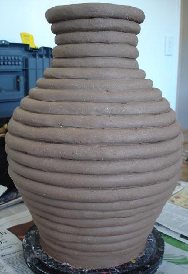
Kevin Repice, Principles of Art Repetition, 2015, Mixed Media
Kevin Repice, Principles of Art Pattern, 2015, Mixed Media
Kevin Repice, Principles of Art Contrast, 2015, Mixed Media
Kevin Repice, Principles of Art Movement, 2015, Mixed Media
Kevin Repice, Principles of Art Scale, 2015, Mixed Media
Kevin Repice, Principles of Art Proportion, 2015, Mixed Media
Kevin Repice, Principles of Art Unity, 2015, Mixed Media
Kevin Repice, Principles of Art Harmony, 2015, Mixed Media
Kevin Repice, Principles of Art Rhythm, 2015, Mixed Media
Kevin Repice, Principles of Art Card Variety, 2015, Mixed Media
I learned the differences between many closely related principles of art. I like how the fruit stands out in every card. I would improve most of these cards as these look very rushed.
Sketch included below.